Designing an accessible & engaging reading experience
CONTEXT
Monday Morning (MM) is the second-largest student media body in India. MM writes about news, articles, comic strips, etc. In addition, they have an active website via which they serve content written and maintained by the team at MM.
Their website is well received by the NIT Rourkela community, which led to them launching an Android app. However, after the launch, it wasn’t well-received by the users. Since I have worked alongside the MM team in the past, the team reached out to work together. Hence, I decided to take up this project and redesign the MM app. In the case study, I will take you through my process while redesigning the entire experience.
CONTEXT
Research, analysis, product design, user testing
CONTEXT
Apr - May 2020
CONTEXT
Abhay Rahul
RESEARCH
Heuristic evaluation
I started with doing an app critique. While using the app, I noted there were frictions that I was facing. I focused on interaction design, navigation, copywriting of the app. So, following it, I conducted a proper heuristic evaluation of the app. Visual design aside, I faced a lot of accessibility and navigation challenges while exploring the old app.
Old app
Business Interviews
I interviewed 15 users for usability testing. I asked them to perform basic operations on the app; tasks like searching for an article, finding bookmarks, sharing an article, and navigating the app. Meanwhile, I recorded the difficulties they were facing while they accessed the various features of the app.
To keep the data unbiased, I chose students from different year groups. I also spoke to the MM team about their constraints and their challenges while designing and developing the app.
User Interviews
User insights
Users found the article reading experience difficult.
13 out of 15 users thought that the navigation confusing.
The content presented to the users were not aligned with their interest.
Business insights
The brand value was not clearly communicated to the users with the current design.
The engagement rates did not meet expectations.
Developer feedback: The app used a lot of gestures and unusual design patterns. It made the development process complicated and complex.
Competitor Analysis
The problem at hand is not new. It’s been already solved up to an extent. To avoid reinventing the wheel and understand the domain better, I started looking at other apps for how they have solved this and the best practices they are following. I looked at the following app from the same domain.
Major sections of the app
SOLUTION
Wireframe
SOLUTION
Jobs to be done
JTBD helps to look at the exact motivation of a user, not implementation. I used this framework to understand how a user navigates and performs different actions in the app.
As a user, When I sign up, I want my interests captured, so I can read relevant articles that are personalised to me.
As a user, When I sign up, I want my interests captured, so I can read relevant articles that are personalised to me.
Visual design & insights
Improved navigation and home screen experience
PROBLEM
JTBD helps to look at the exact motivation of a user, not implementation. I used this framework to understand how a user navigates and performs different actions in the app.
SOLUTION
I brought important sections to bottom bar which makes them easier to access. I introduced consolidated menus to quickly browse through different sections. I decided to go with one hero article on the home page, followed by top stories this week, followed by their interest as they scroll.
Improved the article reading experience
PROBLEM
The old article reading page lacked a visual hierarchy that didn’t allow users to read for longer, which is the app's core purpose.
SOLUTION
Introduced different type size to clearly emphasize between heading and paragraph. Improved the readability and scanability of the article. When you scroll to the bottom, you can add comments, and new similar articles will be suggested for seamless extended reading.
Search as a way to explore popular articles
PROBLEM
The search feature was hidden inside the logo button in the old design, which was not accessible and hard to navigate.
SOLUTION
The search feature is brought upfront and made easily accessible. Search also acts as a way to discover new articles from other users with similar taste. A new section was added to give highlight old evergreen articles from the archives.
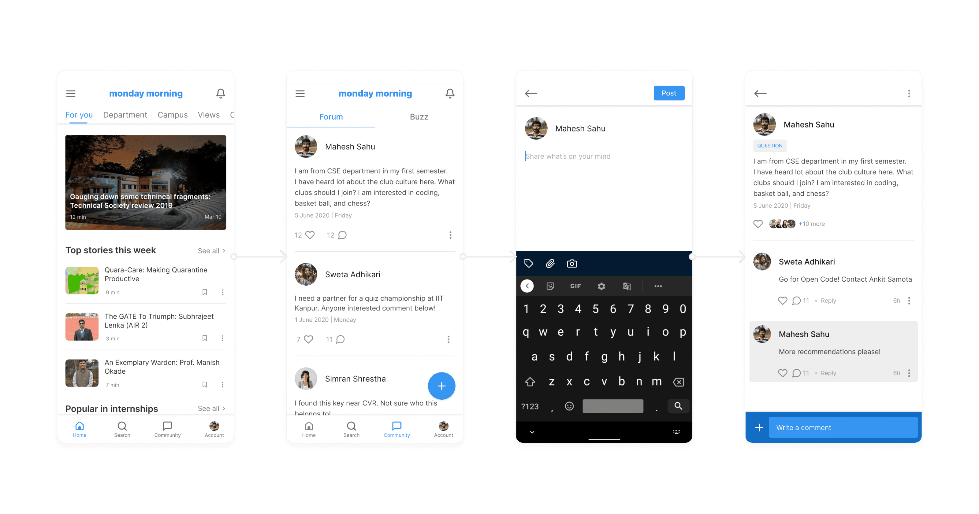
New community feature to engage more with users
PROBLEM
We discovered a new area we wanted to experiment with during the research phase — Monday Morning Community.
SOLUTION
Initially, we thought of a way so that the entire NITR junta can have a platform to interact with each other. We also included an existing forum and buzz features in this section.
Conclusion
Through this redesign, I have optimised the problem mentioned above statement. The final prototype was tested with the users, and they were successfully able to browse and navigate with the redesigned version of the app.
Learnings ✨
Understanding the constraints but not letting them decide the solution is essential.
Thinking of all the possible solutions & applying constraints to them can help you converge towards a solution.
Question everything to have a better understanding and reduce biases.
Testing your solution with users is a crucial step to achieve the best possible solution.
Talk to users and business stakeholders. Understand them.
Empathize with them but at the same time, trust your gut as well. Also, design a solution that helps all the stakeholders.


